Widget Styling and Placement Options
Widget styling and placement decide whether visitors open your chatbot or ignore it. See the color, theme, position, and launcher options and where each one fits.
A visitor lands on your pricing page, hesitates, and has a question. Whether they ask it depends on something small: does the chat launcher feel like part of your site, or like a banner ad bolted on by a third party? Widget styling and placement settle that in the first second. Get them right and the widget reads as your brand offering help. Get them wrong and people scroll past it, or worse, close it on reflex. We built the styling controls into BestChatBot so the assistant matches your site instead of fighting it, because a help widget nobody opens is just clutter in the corner.
This is the visual side of the website widget. The answers come from your knowledge base and the actions run on your connected tools, but none of that matters if the launcher gets ignored. Let's break down what you can change, and where each choice earns its place.
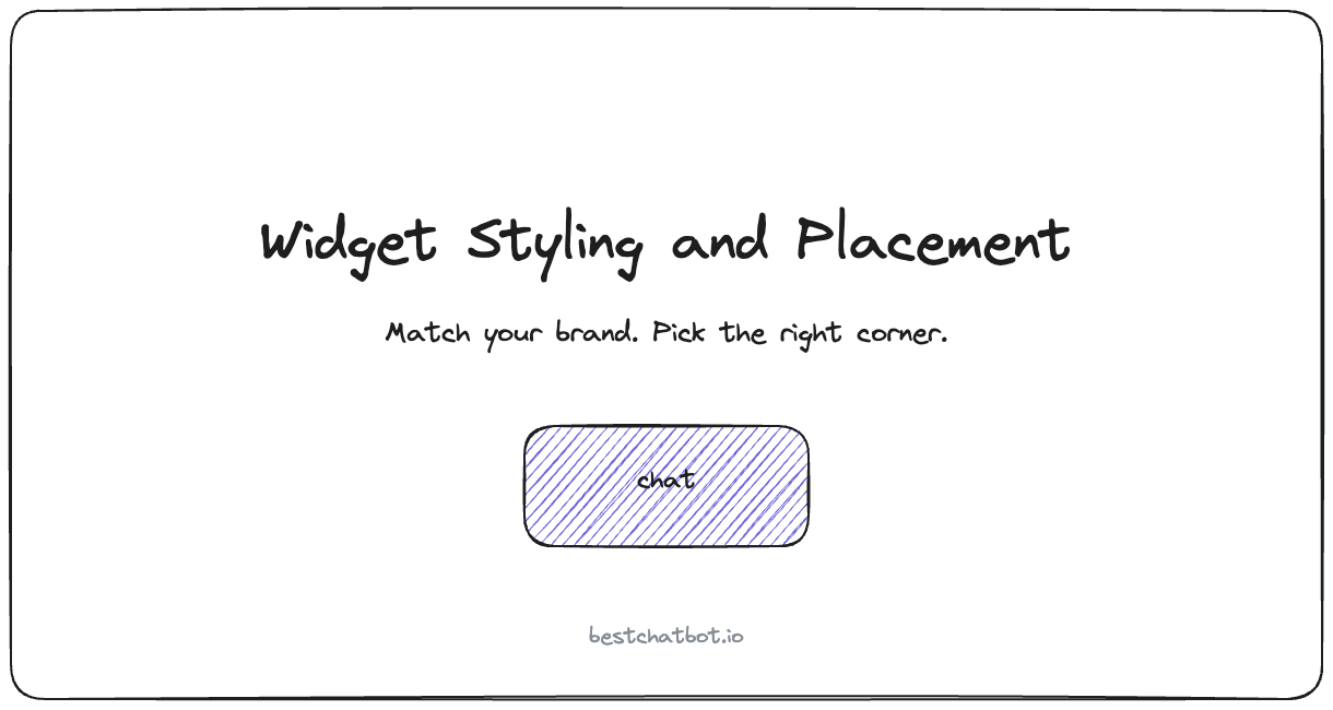
What you can actually style
The widget is one surface, the web, and we kept the controls focused on that surface rather than spreading thin across channels. Chatbot widget customization here covers the parts a visitor sees before and during a chat: the launcher in the corner, the chat panel that opens, and the small details that make it feel native.
Here is what you control:
- Accent color for the launcher and the send button, set to your brand color so the widget reads as yours.
- Light or dark theme for the chat panel, matched to the page it sits on.
- Launcher shape and icon, so the bubble looks deliberate instead of generic.
- Greeting message and avatar, the first thing a visitor reads when the panel opens.
- Corner radius and spacing, the quiet details that separate a polished widget from a pasted-in one.
None of this touches what the bot says. The answer logic stays grounded in your content. Styling is purely how the help is dressed, and a visitor judges that dressing before they read a single reply.
Color and theme: matching the brand without a redesign
Most teams want one thing from styling: the widget should not clash. A bright blue launcher on a warm, muted site looks like it wandered in from somewhere else, and that mismatch quietly tells visitors the chat is an add-on, not part of the product.
The accent color is the single setting with the most payoff. Set it to your primary brand color and the launcher, the send button, and the active states all fall in line. Then pick light or dark theme to match the page, not the whole site. A widget on a dark landing hero can run dark while the same widget on a white docs page runs light. The point is that the visitor never notices the widget as a separate object. It just looks like your site grew a help button.
We think this matters more than people expect. A polished, on-brand widget gets opened more often than a default one, for the same reason a well-set table makes you more likely to eat. The styling is not decoration, it is a trust signal that says this help was built on purpose. Color and theme are the surface layer of the same idea behind brand tone customization, where the widget's wording gets tuned to sound like your team. One handles how the widget looks, the other how it reads.
Placement: where the launcher sits and why it matters
Placement is the decision people skip and then regret. The default is the bottom-right corner, and for most sites that is the right call. It is where visitors have been trained for years to look for help, so it works without explanation. But the right corner is not always free, and the wrong corner can hide the widget or cover something important. The chat widget position is a real layout choice, not an afterthought.
A few common situations and the placement that fits:
| Situation | Better placement |
|---|---|
| Standard marketing or docs site | Bottom right, the expected spot |
| Bottom-right already has a cookie banner or back-to-top | Bottom left, so nothing overlaps |
| Mobile-heavy traffic with a sticky bottom bar | Raise the launcher above the bar so it stays tappable |
| Checkout or pricing page where help drives conversion | Keep it bottom right and visible, never tucked away |
Placement also includes spacing from the edge. A chat bubble placement jammed into the very corner can collide with a sticky element or sit awkwardly on small screens. A little breathing room keeps it tappable and clean. The goal is simple: the visitor should find the widget the instant they want help, and never have it block what they came to do.
The launcher and greeting: the first impression
Before a visitor reads any answer, they see two things: the launcher bubble and, when they open it, the greeting. Both are styling decisions, and both shape whether the chat starts at all. The website chatbot launcher is the part most visitors notice first, so it earns real thought.
The launcher can be a plain bubble or carry an icon that hints at what is inside. A question mark reads as help. A chat icon reads as conversation. Pick the one that matches what your widget mostly does, support questions versus sales chat, so the visitor's expectation is set before they click.
The greeting is your one free line. A generic "Hi, how can I help?" works, but a specific opener does more. "Ask about returns, shipping, or your order" tells the visitor the widget actually knows your store, which makes them more likely to type a real question instead of bouncing. The greeting is grounded the same way the answers are: it should promise only what your knowledge base can back up. If you wire up identity-gated actions later, the greeting can also hint at what a signed-in visitor can do, like check an order or book a slot.
Where styling fits in the bigger setup
Styling is one panel in a wider widget configuration, and it is worth knowing where it sits so you do not over-invest in pixels before the basics are live. The order that works: install the widget, point it at your knowledge, set the tone, then style and place it.
If you have not installed yet, the setup guide walks through getting the widget on a page, and the web widget overview covers what the widget does once it is live. Styling and placement sit on top of those, alongside tone, citations, and identity rules, as part of how you run your website chatbot. The visual settings are quick to change, so it is fine to ship a sensible default and refine the color and corner once you see it on the real page.
One install detail worth flagging: the widget loads from a single embed snippet, so styling changes apply across every page it sits on without re-pasting code. If you manage the embed through a tag manager or a platform plugin, the website widget install guide covers how the snippet drops in and where the styling settings live relative to the install.
FAQ
Can I match the chat widget to my brand colors?
Yes. The accent color drives the launcher, send button, and active states, so setting it to your primary brand color makes the widget read as part of your site. You also choose a light or dark theme to match the specific page the widget sits on.
Where should I place the chat widget on my site?
Bottom right is the default and fits most sites, since visitors expect help to live there. Move it to the bottom left if a cookie banner or back-to-top button already occupies the right corner, and raise it above any sticky mobile bar so it stays tappable.
Does changing the widget styling affect the answers?
No. Styling and placement only change how the widget looks and where it sits. The answers stay grounded in your knowledge base, and the bot still declines when a question falls outside your content regardless of the theme or color you pick.
Do I need to re-install the widget after styling changes?
No. The widget loads from one embed snippet, so styling and placement changes apply everywhere the widget runs without touching the code again. You change the settings once and they propagate to every page.
Can I use a custom greeting message?
Yes. The greeting is the first line a visitor reads when the panel opens. A specific opener that names what your widget handles, like returns or order status, gets more real questions than a generic hello, as long as it only promises what your knowledge base can answer.
To see which plan includes the styling, placement, and action features you want, head to pricing.